Color and Its Definition
The gold color, inspired by the traditional Saudi dagger, symbolizes strength, determination, and national pride.It reflects the values of authenticity and heritage deeply rooted in the Kingdom’s identity.Through this color, the Bridge Health Business Services Company logo embodies a spirit of excellence and dedication in serving people and building a healthcare community that takes pride in its connection to the nation.


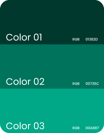
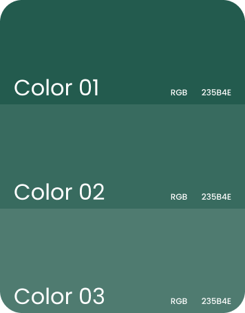
Color and Its Definition
The green color, inspired by the Saudi Arabian flag,
reflects the spirit of the nation and its dedication to
building a healthy and sustainable society.
It symbolizes the union of national pride and the
commitment to human health and quality of life
values embodied in the Bridge Health Business
Services Company identity.
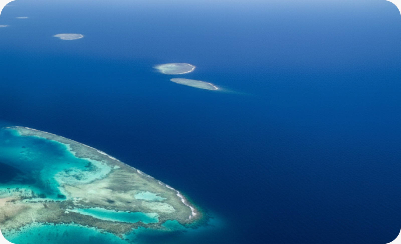
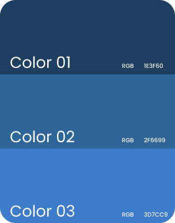
Color and Its Definition
The blue color, inspired by the color of the sea, symbolizes
depth, trust, and clarity, reflecting a sense of peace and
balance.In the Bridge Health Business Services Company
identity, this color represents the spirit of stability and
reliability, supporting the company’s mission to build a
healthy and harmonious society.

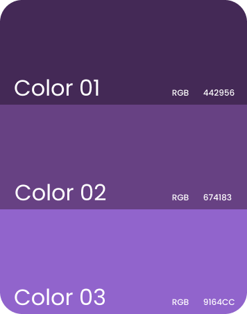
Color and Its Definition
The purple color, inspired by the lavender plant, symbolizes calmness, comfort, and renewal, drawing from the beauty of nature and the fragrance of the Kingdom’s land.In the Bridge Health Business Services Company identity, this color reflects the spirit of care, emotional balance, and physical well-being, supporting the journey toward building a society that enjoys health, harmony,and prosperity.

Color and Its Definition
The green color, inspired by the palm fronds shown in the image, symbolizes life, growth, and continuous generosity, drawn from the Kingdom’s rich and authentic natural beauty.In the Bridge Health Business Services Company identity, this color represents sustainability, vitality, and renewal, expressing theproject’s mission of caring for people and supporting their well-being.

Color and Its Definition
The gold color, inspired by Saudi heritage as shown in the image, reflects the warmth of the land and the authenticity of Najdi architecture, which embodies the Kingdom’s rich and enduring history.In the Bridge Health Business Services Companyidentity, this color represents stability, heritage, and belonging, symbolizing deep roots that build a prosperous present and a healthy future.

Color and Its Definition
The white color in the image represents the color of the
traditional thobe, symbolizing purity, simplicity, and
tranquility.It reflects cleanliness and clarity, and is widely
used in Gulf attire for the sense of calm, comfort, and
refined formality it conveys.

Color and Its Definition
The black color in the image represents the color of the traditional bisht, a symbol of elegance, dignity, and formality in Arab attire.Paired with the gold accents in i ts embellishments and embroidery, it conveys a sense of prestige and grandeur, giving the garment a ceremonial character that reflects authenticity a nd distinction.


Image One:
This image shows a scene of a woman performing traditional hand
weaving on a wooden loom, working with multiple colored threads
arranged in precise harmony.The composition is inspired by this
scene to symbolize the connection and harmony between the
elements of life and health — just as weaving threads intertwine
to form a unified whole.The shapes and lines in this image capture
the spirit of the “Bridge Health Business Services Company” logo,
which is built on the idea of linking and integrating the human, the
community, and the environment.
Image Two:
This image shows a woman’s hand touching a piece of woven fabric
decorated with vibrant geometric patterns.It symbolizes the human touch
and care, which form the foundation of the “Bridge Health Business Services
Company” concept.The geometric shapes in the fabric represent harmony
and balance, while the interaction between the hand and the textile reflects
the values of connection and care embodied in the logo.
Image Three:
This image displays a collection of decorated bowls featuring colorful circular
geometric designs.These forms draw inspiration from traditional arts that
express cultural identity and belonging, and they have been adapted in a
modern style to create visual patterns inspired by the “Bridge Health Business
Services Company” logo.The circle in the design symbolizes continuity and
integration, which is a central concept in viewing health as a holistic system
that connects the body, mind, and community
Image Four:
This image represents a segment of traditional Arab architecture, with its clay
walls and serrated upper edges that reflect strength and stability.From this, the
structural aspect of the “Bridge Health Business Services Company” logo was
inspired, where the geometric angles and repeating patterns are translated
into a bridge that connects the past with the present.This visual link between
heritage architecture and modern design embodies the message of continuity
and connection at the core of the Bridge Health Business Services Company
concept — a bridge that connects
people to their roots and cultural identity